Concept Project
Luma Skin Studio
A self-directed premium skin-studio concept built around calm expertise and considered treatment direction.
Self-directed concept study.
View the concept website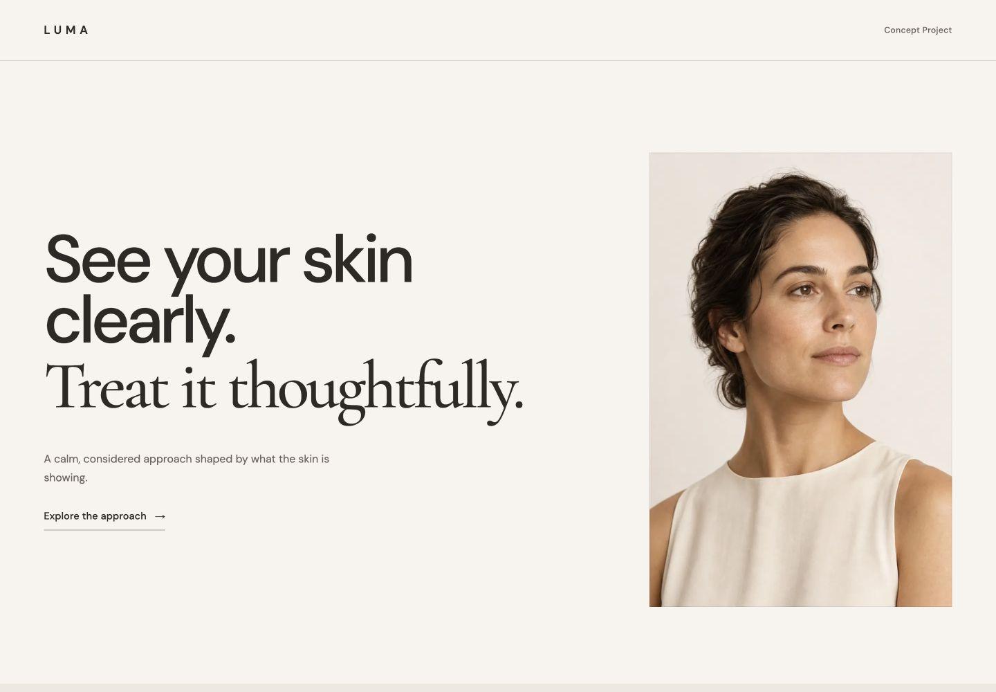
Calm expertise without the spa clichés.
The fictional brief was to create a premium esthetics experience that feels clear, modern, and expert without becoming generic wellness branding or an overly clinical interface.
The response is Modern Clinical Minimal: Warm Stone, Espresso, Sage, and Soft Ivory; mostly sans-serif typography with restrained serif moments; Clean Studio photography; rectilinear geometry; and a quiet path to consultation.
PresenceCalm + expert
PhotographyClean Studio
InterfaceMinimal + rectilinear
Point of viewFaceless + brand-led
See your skin clearly.
Treat it thoughtfully.
Strong negative space and clean skin imagery establish an Editorial Diagnostic point of view: look first, understand what the skin is showing, then choose what actually makes sense.
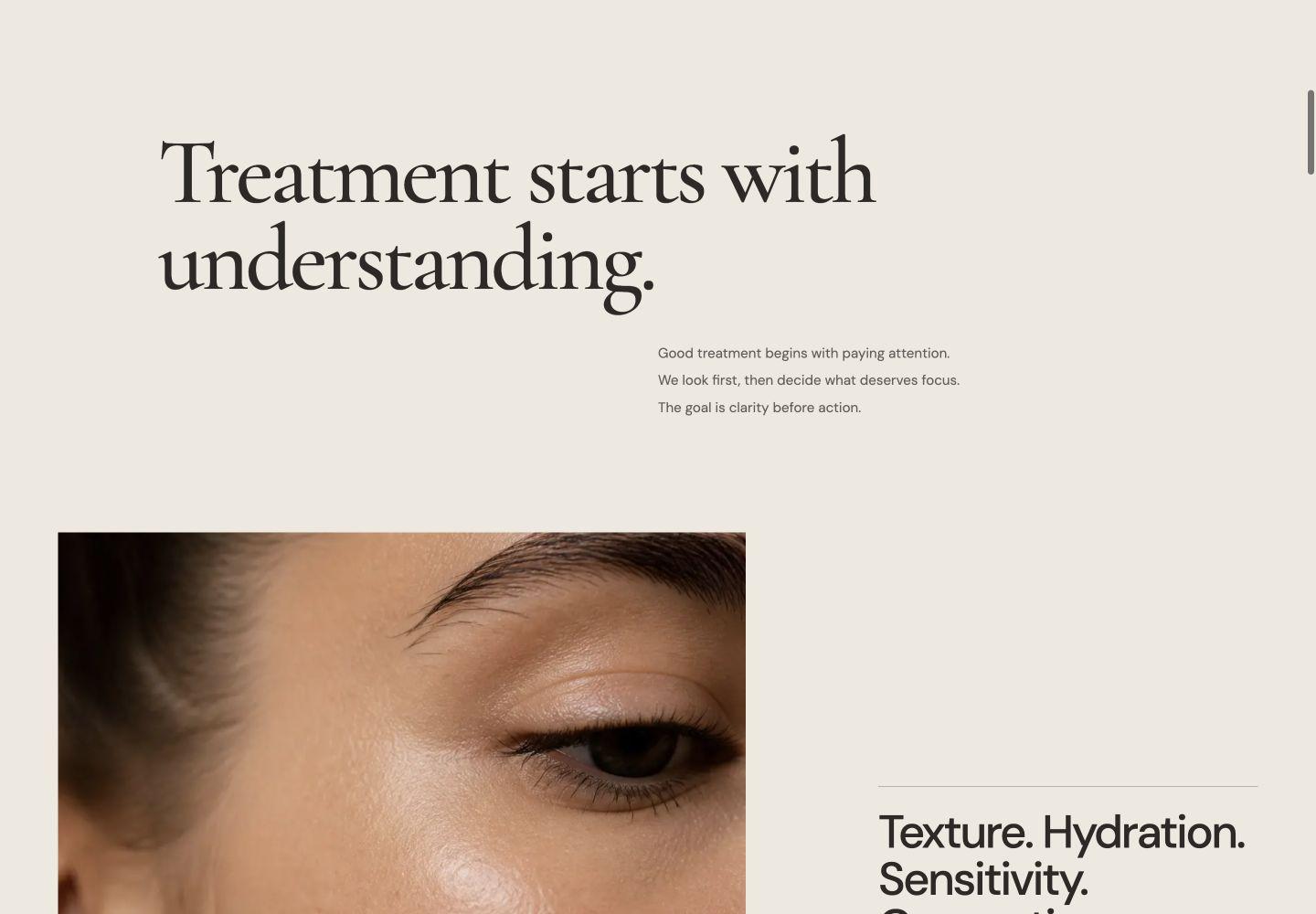
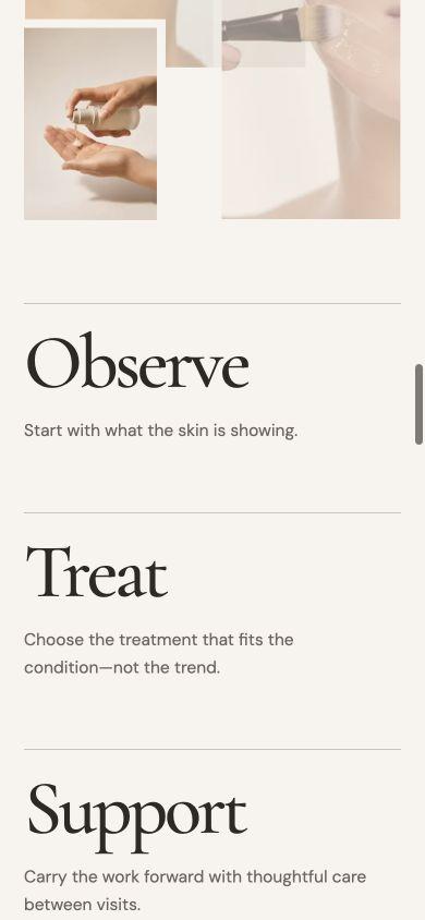
Observe. Treat. Support.
The experience progresses from skin to treatment to aftercare. On desktop and tablet, a restrained sticky progression lets the imagery carry the stage change. Mobile translates that same story into shorter anchored moments without forcing desktop choreography onto a phone.
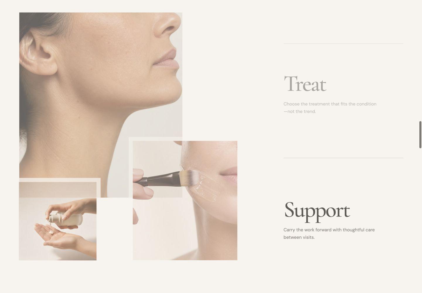
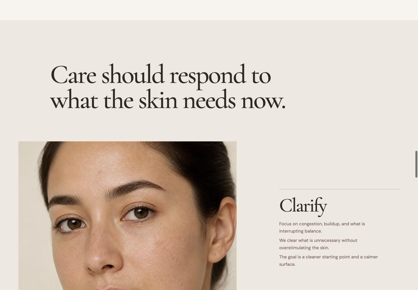
Four directions. One considered system.
Clarify, Restore, Refine, and Maintain are presented as an asymmetric editorial sequence rather than four equal service cards. The changing image scale and placement create variety while the writing stays concise and measured.
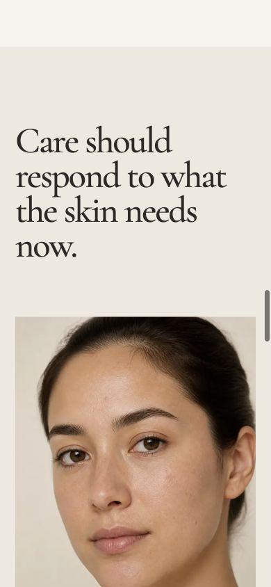
Designed for the screen in front of it.
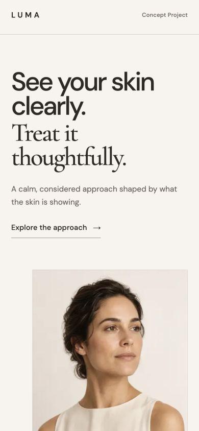
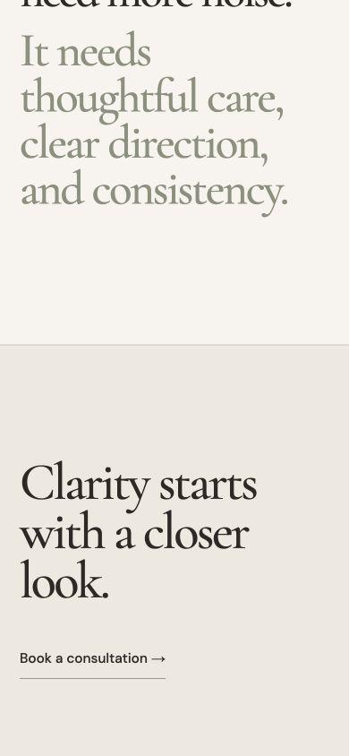
Mobile is recomposed rather than reduced. Headline scale, image order, sticky intervals, and the relationship between copy and photography were adjusted for a narrower, touch-led reading experience.
View the concept website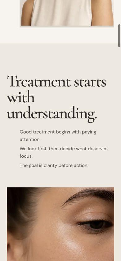
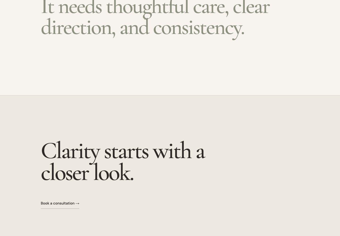
Restraint carries through the final moment.
The concept ends without urgency, testimonial theater, or a heavy conversion panel. The final statement and text-link CTA keep the experience quiet, clear, and consistent with Luma’s point of view.
Want a website with a point of view?
Start with the application. If the project is a fit, we will establish a clear direction before the full build begins.
Start Your Website